
Maven Careers is an organization which provides insights on trends within the job market. They give information on the best jobs, the field with the highest pay, jobs with great work-life balance, the future growth of different fields, etc.
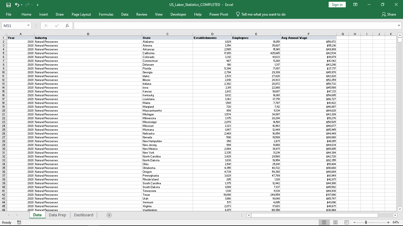
Excel file containing dataset
A lot of data was derived from taking multiple surveys and they needed to determine what wage and employment figures based on different industries. The project focused on 10 industries within the United States. These industries include: Information, Finance, Business Services, Manufacturing, Construction, Natural Resources, Education and Health, Trade and Transport, Leisure and Hospitality, and finally, Other Services.
The dataset comprised of approximately 2000 results split into different categories based on the Industry type, States with the United States, Year, Number of Employees and Annual Wages.
The project focused on building an interactive dashboard which clearly represented the following:
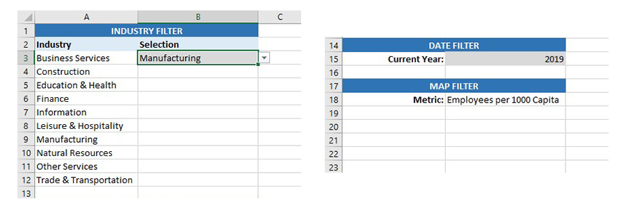
Dropdown List for Industries and Years to make dashboard dynamic
The project began by cleaning the dataset in Excel to prepare it for analysis. The cleaning process was followed by consolidating the dataset into a table where I worked on various calculations to ensure the interactivity and statistical correctness. This involved the addition of elements such as form controls and also the use of Excel functions to build measures. All these played into building a dashboard that was dynamic and insightful.
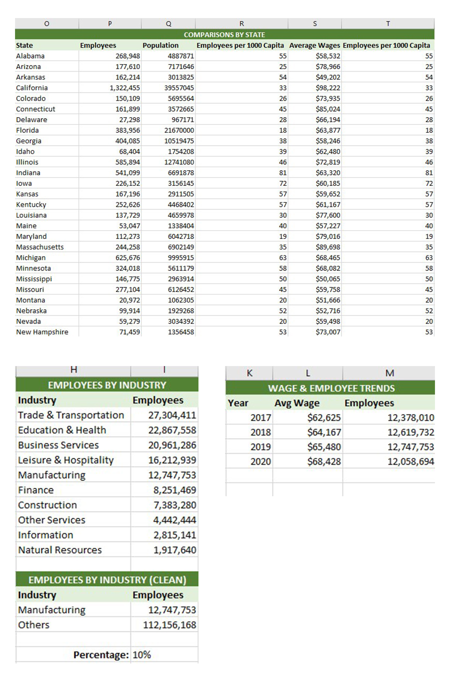
Statistical Measures to used for Charts
The project continued with building a dashboard which was interactive. Key features included the use of charts, maps, dropdowns, colors, radio buttons, etc. to give the Dashboard a good appearance & user experience.
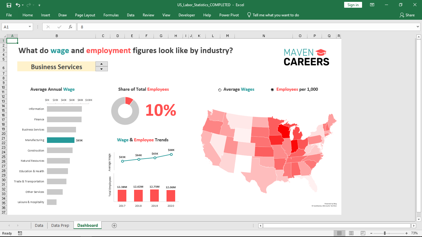
Excel Dynamic Dashboard
The dashboard clearly shows each required need of the organization. It shows the average annual wage of workers by industry, it also shows a share of employees by industry. It highlights wage and salary trends from 2017 until 2020 based on industries. It also highlights the change in total number of employees per year.
I'm happy to connect, listen and help. Let's work together and build something awesome. Let's turn your idea to an even greater product. Email Me.