Menu

Case Study: YouTube Sentiment Analysis with Python

Role: Data Analyst

Tools: Python Libraries - NumPy | Pandas | Textblob | WordCLoud | Matplotlib | Seaborn

Challenges

  • Filter Positive & Negative Comments .
  • Use Sentiment Analysis to differentiate positive comments from negative comments
  • Use Regression analysis to identify the relationship between “Views and Likes” & “Views and Dislikes”.

Process

The project focuses on analyzing 2 datasets. Each dataset contains information such as the Video ID, Comments for each video ID, views, number of likes and replies. The goal was to create a function which reads through the “comment_text” column and returns a sentiment analysis ranging from 0 to 1.

To address this challenge, different Python libraries were used such as:

  • Numpy & Pandas (for statistical measures)
  • Textblob (for sentiment analysis purposes)
  • Matplotlib & Seaborn (for graphical charts)

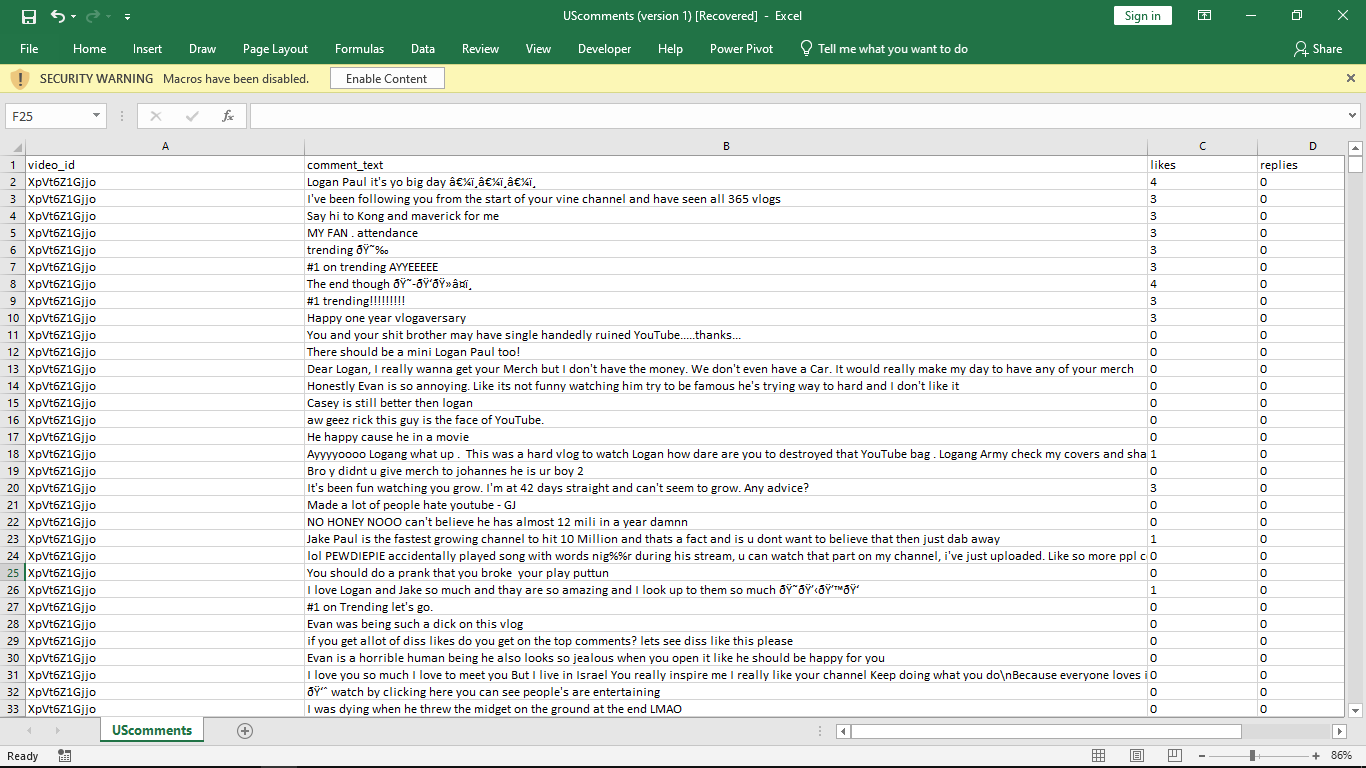
Extracted Dataset from YouTube A

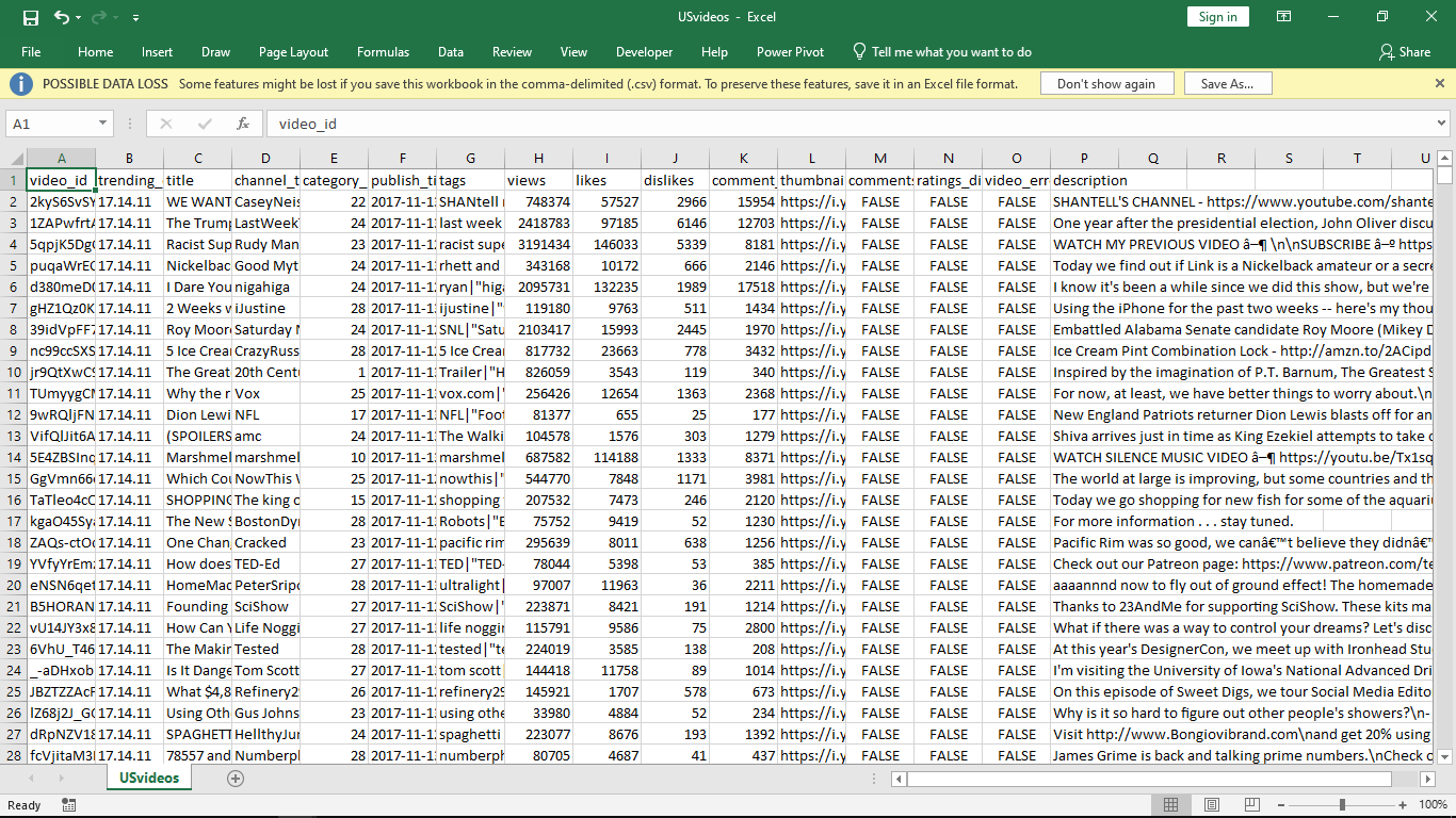
Extracted Dataset from YouTube B
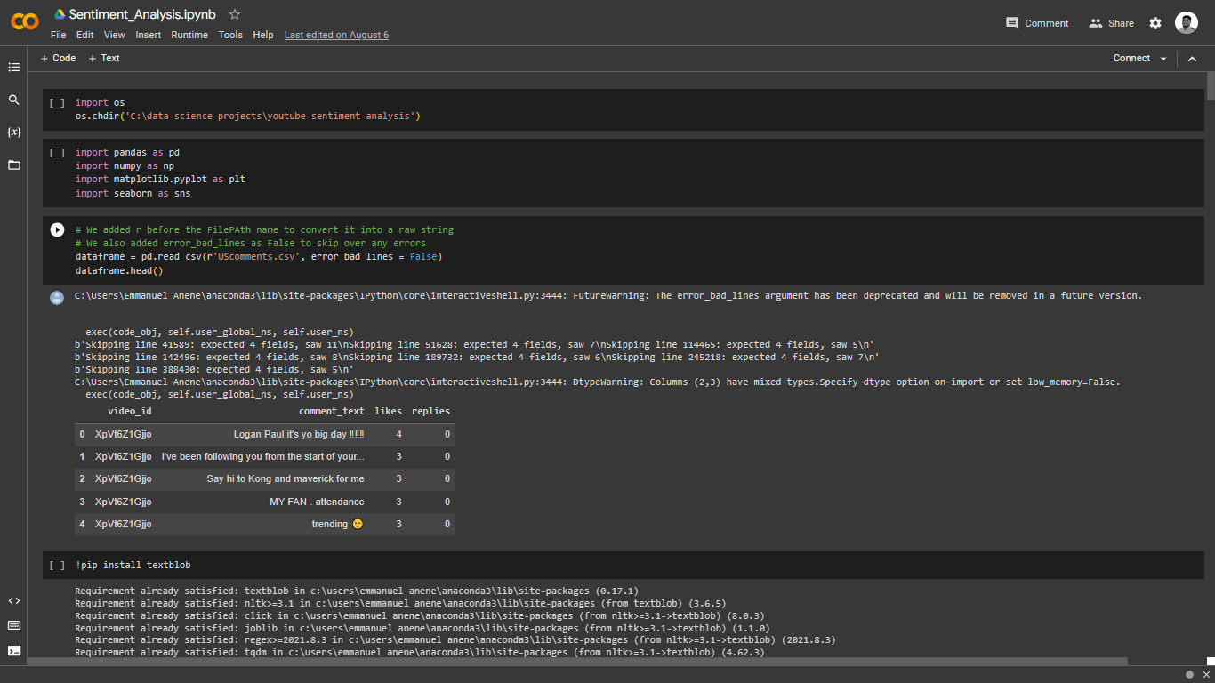
A. Filtration & Sentiment Analysis [Work Process]

  1. Filtering Positive comments from Negative Comments: We employed the use of For Loops to run a sentiment analysis on each row within the “Comment_text” column. Then, we parsed the result into an empty list.

  2. Project Preview


  3. The result from the sentiment analysis process resulted in the formation of a new column with values ranging from +1 to -1. -1 signifies that the comment has negative words while +1 signifies that the comment contains positive words. Values in-between signifies that the comment had a neutral tone.

    The empty list which now contains the dataset for was joined to the original table/dataframe using:
    dataframe[‘empty_list’] = new_overall_table
    (Here I have added the new list – containing result from Sentiment Analysis – to the main table i.e. dataframe).


    Next, we filtered the “new_overall_table” to show only either positive (+1) OR negative comments (-1).
    Positive_values = new_overall_table [new_overall_table[‘empty_list’] == 1]
    Negative_values = new_overall_table[new_overall_table[‘empty_list’] == -1]


    We proceeded to join all the statements (row by row) under the “comment_text” column after it had been filtered (i.e 1 or -1). We achieved this using a JOIN function:
    Total_positive_comments = “ “.join(positive_values[‘comment_text’])
    Total_negative_comments = “ “.join(negative_values[‘comment_text’])


    Regex Library was also imported and used to eliminate unwanted characters within the joined result.

  4. Using Wordcloud to Highlight positive comments from negative ones. WordCloud library was installed to enable us plot a chart that highlights the most & least used positive/negative words.
    Wordcloud = WordCloud (width=1000, height = 400, stopwords = set(STOPWORDS)).generate(Total_positive_comments)
    OR
    Wordcloud = WordCloud (width=1000, height = 400, stopwords = set(STOPWORDS)).generate(Total_negative_comments)

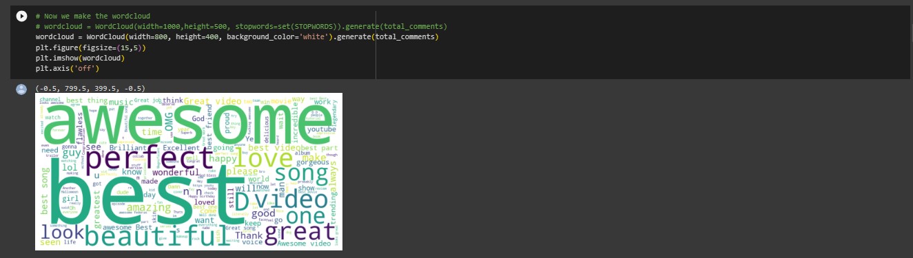
WordCloud for Positive Keywords

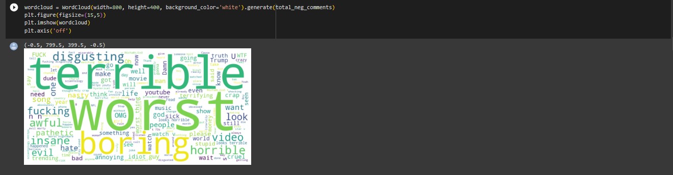
WordCloud for Negative Keywords

Conclusion: Filtration & Sentiment Analysis

Based on the wordcloud chat, we were able to confirm that some of the most used positive words used in the comments includes (Best, Awesome, Perfect, Beautiful, Great Love, etc.). We were also able to confirm that some of the most used negative words were (Terrible, Worst, Boring, Disgusting, etc.).

B. Determine Relationship between “Views, Likes & Dislikes”

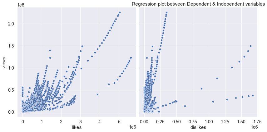
For this, we employed the use of regression analysis to determine the relationship between the parameters. We began by identifying the independent and dependent variables in out parameters.

Dependent Variable (Y) – Views
Independent Variable (X) – Likes & Dislikes

Each column consisted of continuous variable hence there wasn’t a need to convert the data into dummy variables. We began by isolating only the needed columns (Views | Likes | Dislikes)

We followed by running a CORRELATION MATRIX on the 3 columns to identify any similarities that existed between the dependent and Independent variable.

Pairplot Chart between Dependent & Independent Variables

Conclusion: Relationship between “Views, Likes & Dislikes”

We were able to conclude that there was a greater relationship between Views and Likes (85%) compared to the relationship which existed between Views and Dislikes (47%).

We also plotted a regression graph to identify the amount of relationship that exists between the results and a similar inference was obtained.

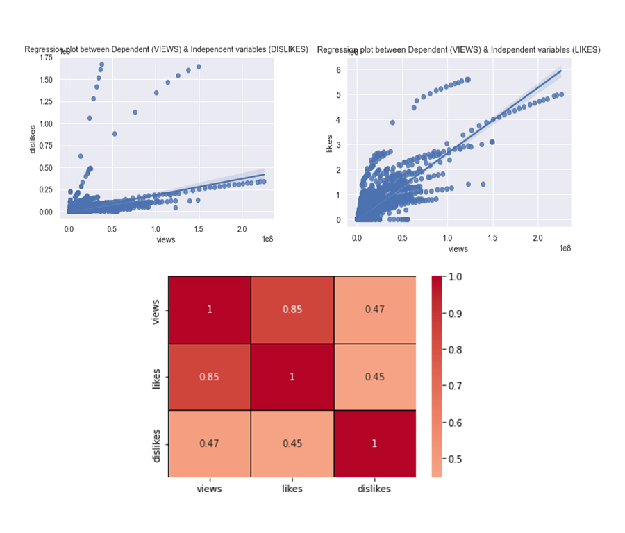
Regression Plot & Correlation Matrix Chart

See Full Code on Google Colaboratory.

See Case Study on Github.

Get In Touch

I'm happy to connect, listen and help. Let's work together and build something awesome. Let's turn your idea to an even greater product. Email Me.